In iOS 15, Apple's stock Weather app received a major design overhaul, thanks in part to a number of features brought over from the popular weather app Dark Sky, which Apple acquired in 2020.
These features have made the Weather app interface a lot more detailed and extended existing sections to include things like weather maps, rainfall, air pressure, and more.

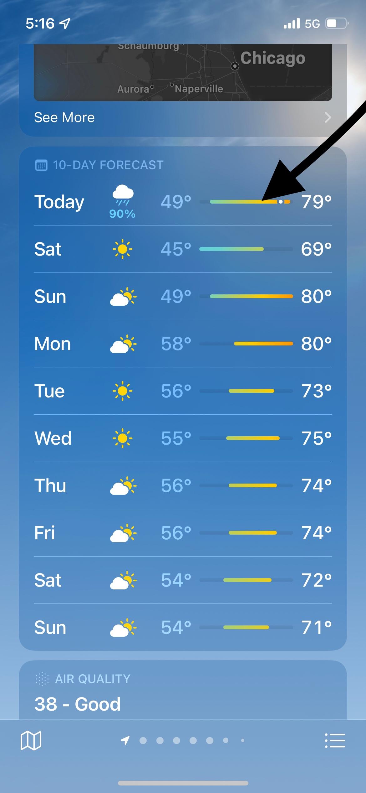
Apple has also redesigned the 10-day forecast to include more at-a-glance information, and if you're wondering what the horizontal bars mean, they simply offer a view of the likely temperature range over the course of each day.
The longer the horizontal bar for any given day, the more variable the temperature could be over that 24-day period. You can get a better idea of this when looking at today's temperature at the top of the 10-day forecast. The white dot on the bar is where the current temperature fits in the forecasted range.
What Do the Temperature Range Colors Mean?
A legend of these color codes can also be found when you open a location's Temperature Index map.
In Apple's revamped Weather app, you can also sign up for next-hour precipitation notifications that will alert you when it's going to rain, snow, or hail in the next hour in your current location, or another location that you've added to the Weather app.
